Linepulse

Through an existing client and contact I was contracted to design a new microsite for Otis Lifts based around their new 'Linepulse' technology which monitors emergency phone lines within thousands of passenger lifts around the globe and alerts building owners of potential issues, before they arise in daily operation.
Browser mockup
Linepulse Homepage Design

Brief

I had free reign on the look and feel of the Linepulse microsite, enabling me to step away from the corporate look of other Otis Lifts websites and create a bespoke and interesting solution.

Aims

The primary aim of the website was to convert building owners to purchase a Linepulse plan and allow them to then manage all passenger lifts in all buildings through a simple interface.

Design concepts

Striking accents paired with a dark colour scheme overall give the designs produced a bespoke and individual look and feel, memorable to those used to the mainstream corporate designs of most life operators/manufacturers.
About Linepulse page design

About Linepulse page

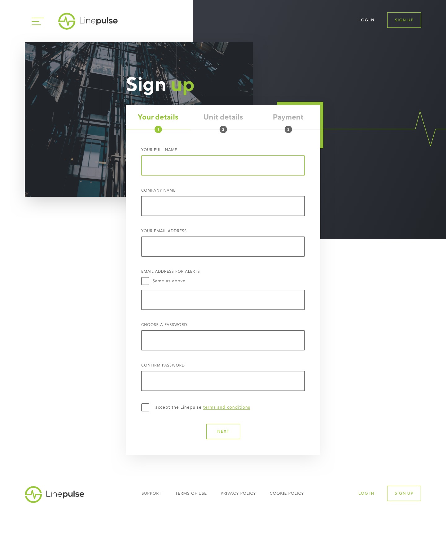
Linepulse Register - Step 1

Sign up page

Linepulse Account page

Account page

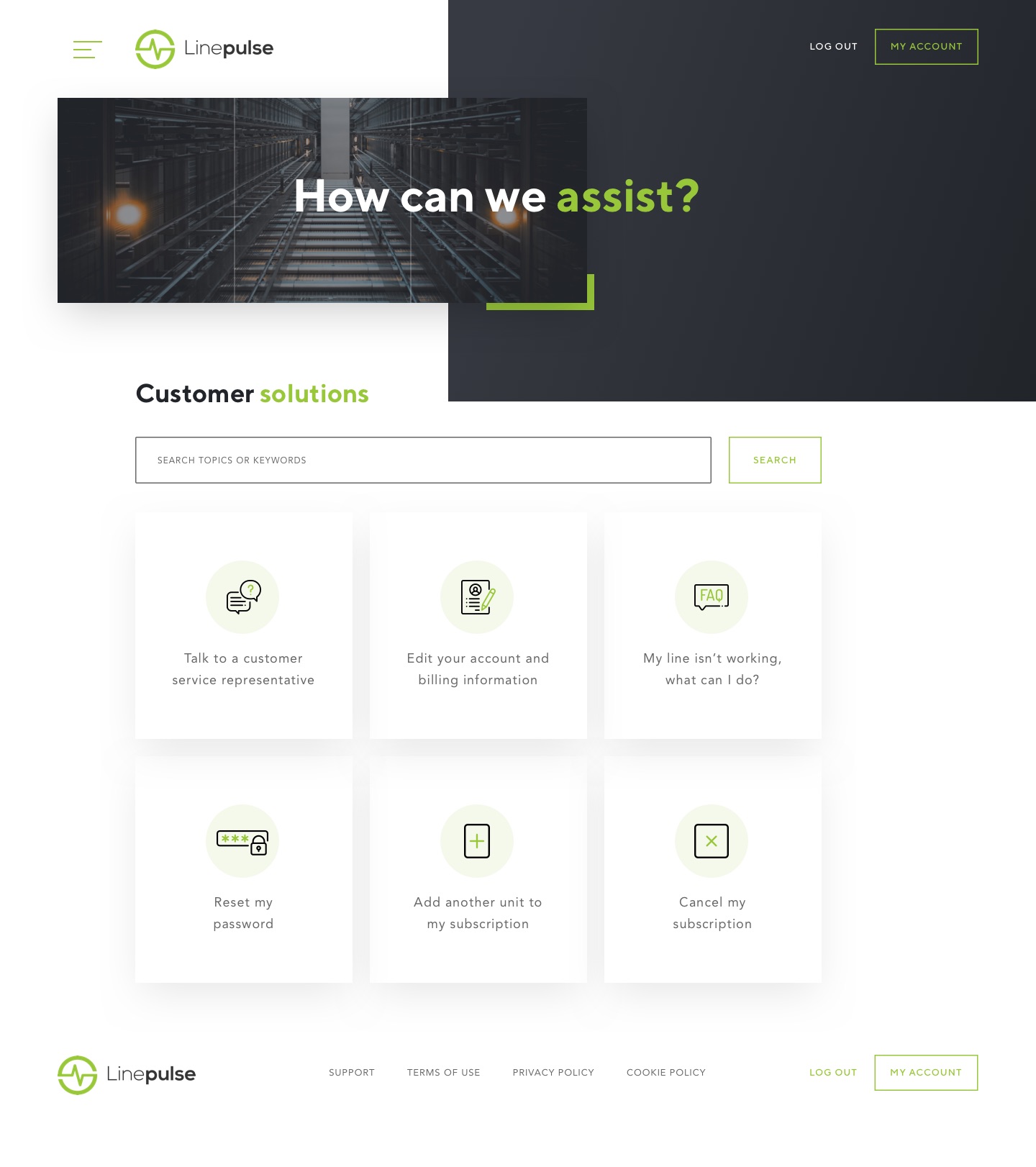
Linepulse Support page

Support page

Responsive

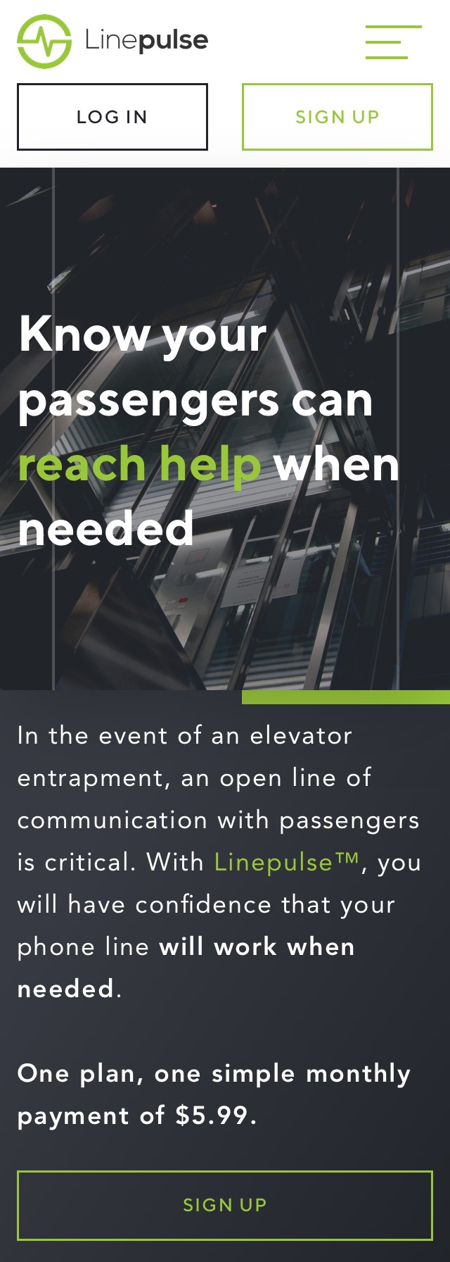
Each design concept was also designed for both tablet and mobile views, before being passed to Otis developers for implementation.
Linepulse Homepage - Mobile
Linepulse Register - Mobile
Linepulse Homepage - Mobile